 For many of today’s companies and marketers, whether business-to-consumer (B2C) or business-to-business (B2B), email marketing has become one of, if not the, most potent arrows in their marketing quiver. There are many reasons why this is the case. Certainly, one reason is “cost effectiveness.” For a relatively low-cost, marketers can address large lists of email addresses with their targeted message. And thanks to fill-in-the-blanks message templates, email marketing is also fairly easy to create. And finally, once you “push the button,” email marketing is delivered almost instantaneously.
But do you know if your campaigns are effective compared to objective norms? See more here…
Now I know that when I talk statistics, many of my colleagues roll their eyes and sigh. But statistics are your friend…really! Meaningful stats are like a roadmap that helps make sure you are guiding your business in the right direction. Statistics exist not just to grade your past performance…they provide the insight you need to continuously improve.
As most professional marketers know, it is not good enough to just hit the “blast” button to deliver your email message – you need to review key campaign results such that you can improve the effectiveness of future campaigns. But your data on its own is fairly meaningless. Without some objective (and neutral) yardstick showing you the results others are experiencing, it’s hard to know if you are doing well – or have more work to do.
New study offers new benchmarks…
Thanks to some new research, help is on the way in the form of a comprehensive new set of email campaign data. A new study produced by Silverpop, one of the leading email service providers, offers some illuminating data that you can use to benchmark the statistical results from your own email campaigns against.
And we have to say, we’ve seen several previous studies that offer top-level overall results with no meaningful breakdowns. The Silverpop study is more detailed and more meaningful than almost any other study of this nature that we’ve seen.
Silverpop studied the email marketing campaigns of 2,787 brands throughout the entire twelve months of 2012. Not only did the company seek to understand “open” rates and “click” rates, they wanted to get a deeper and more accurate picture.
Don’t be mean, be median…
To make results more meaningful, they decided that they needed to provide more than just average or “mean” rates, they also included the “median” result. For those who have forgotten their high school math, the median is the number in which half of the results are above – and half of the results are below. “Average” – where you divide the sum by the number of items entered, can give you a sometimes misleading result skewed by one or two largely anomalous entries. Many statisticians study both the mean and the median results…but consider the median to be a more accurate gauge.
But not only did this study include the added value of identifying median results – Silverpop went even deeper to include the results from the top quartile (best performers) and the bottom quartile (worst performers). This is an incredible amount of data that allows you to see not only how your stats compare with the average or “norms”…but also how it stacks up against the best and the worst performers in each category. This provides you with a very meaningful set of tools to see where your results fall in the entire performance spectrum.
The overall study is too long to recreate in its entirety in this post, but we will pick a couple of significant results we found enlightening.
Open your mind to a better “Open” rate…
The logical place to begin is the “open” rate…that is the percentage of emails actually opened divided by the number of total messages sent. The higher the open rate, the more of your messages that were actually seen by your targets.
Experts will tell you that this is…at best…a guideline and not a perfect number. Why is that? Because many email clients (or readers) such as Microsoft Outlook allow you to read the message in a preview pane before you actually open it. In many cases, images will not automatically download so you only see the text of the message.
Squishy numbers…
But for many people, this readable preview is good enough and they can look at an email, read it, and discard it – without ever actually opening it. This situation would not count as an “open” by the system, although if the recipient read it, the marketer still benefited from that interaction. But thanks to squishy Internet tracking, it is not reflected in their stats package.
If the subscriber actually takes any action, such as downloading images, clicking on a link in the email, etc. – it would count as an open. Many marketers try to encourage opens by delivering messages with teaser sentences or paragraphs in an attempt to tempt the recipient to click through to get the rest of the message…thereby showing up in their stats as an open.
Country opens…
As you can see in the first table above which ranks performance by country/region, the median open rate in the U.S. is 16.5%, more than twice the open rate of the poorest performers in the bottom quartile of 8.2%. Notice, however, that those top performers in the top quartile experience an open rate more than double the median with a 34.7% open rate.
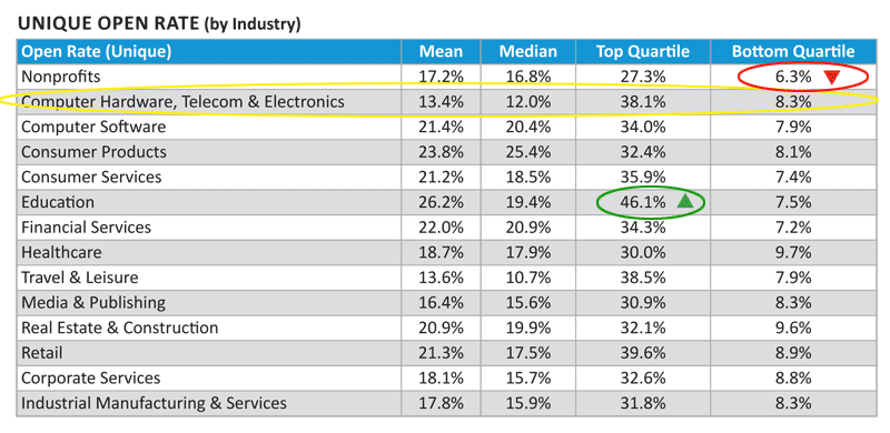
In the second table, Silverpop broke out email marketing campaign results by industry. We have added a yellow ellipse to highlight the category most closely associated with the main readers of strata.gee.com: computer hardware, telecom, and electronics. We have also called out the top performers with a green ellipse and the bottom performers with a red ellipse.
Aren’t consumer electronics also consumer products?…
Some may argue that since consumer electronics are products sold to consumers, the “consumer products” category would be more accurate. Silverpop did not release generally the specific definitions of each of these categories but in most cases consumer products tends to refer to products like toothpaste, facial tissues, etc. Large consumer products companies include Johnson & Johnson, Colgate Palmolive, Pepsi Cola.
We believe the highlighted category is more representative of the consumer electronics industry. As you can see from these results, this category shows a median open rate of 12.0%. The best performers in the top quartile show an impressive open rate of 38.1%. The best industry performance is the 46.1% open rate of the top quartile in education. The worst performance is the 6.3% open rate of the bottom quartile in the non-profit industry which was a full 2% lower than the bottom quartile of the computer hardware, telecom, and electronics industry.
The all-important Click-Through Rate…
Click through rates (CTR) show a similar wide range in performance. This rate, which measures the number of unique clicks on links in the email message divided by the total number of messages delivered, has a median CTR of 2.2% in the U.S. The top quartile turned in a rate almost four times higher coming in at 8.3% while the bottom quartile barely registered with a .6% click-through rate.
For many marketers, the CTR is critical as the primary goal of email marketing is to encourage action by the reader. Marketers will put tremendous efforts into coming up with a compelling “call to action” which is often indicated by the reader being motivated to click through the message to go to the website. There is a whole category of consultants who advise companies on how to improve “conversions,” that is how to get readers to proactively click for more information.
Our industry clicks…
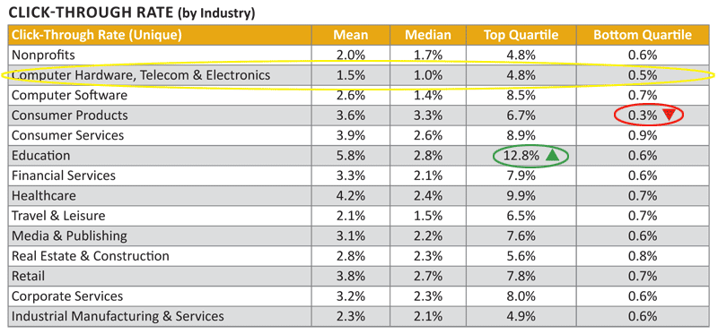
In looking on the table immediately above which breaks results down by industry (same breakdown as the table showing open rate), we see that the computer hardware, telecom & electronics industry has a median CTR of just 1.0%. The top quartile in the category pulls in a CTR of 4.8% which, while much better, is still the lowest rate for the industry top quartile rankings.
The winning industry as far as top quartile performance is again education with an impressive 12.8% CTR. And the bottom quartile loser is the consumer products industry with only a paltry 0.3% CTR…although in our industry the bottom quartile is not much better with only a 0.5% CTR.
Way more stats than we’ve covered…
There are many more tables analyzing various aspects of email marketing campaigns and Silverpop drills down in all of the categories. For example, beyond the open and close rates we’ve shown here, Silverpop also included data on: Gross Open Rates, Opens per Opener, Click-to-Open Rate, Clicks per Clicker, Message Size, Hard Bounce Rates, Unsubscribe Rates, SPAM Complaint Rates, and more.
One noteworthy stat we did not discuss above is that the computer hardware, telecom & electronics industry’ top quartile had the lowest unsubscribe rate of 0.01%, while education had the highest at 0.69%.
Key Takeaways…
This amazing study offers a significant amount of data, elements of which can be used as a yardstick to benchmark various elements of your own email marketing campaigns. You may have known some of these results for your campaign before now. But what you couldn’t know – until this study – is how your results compared with others. Now you do.
You should weigh your own campaign data – especially qualitative data – versus this Silverpop study. Certain yardsticks are a valuable measure in-and-of-themselves. This is especially true of any qualitative data from your past campaigns, such as leads generated, number of items sold, revenues generated, etc. The Silverpop study offers some objective comparison data…but this should be used to expand your understanding of your results…not replace the more direct qualitative data generated directly by your campaign.
Want to see more of the Silverpop study? Simply follow this link…


Leave a Reply