BREAKING NEWS
San Clemente, CA-based Dana Innovations announced today that it is launching a major rebranding effort, the results of which will better reflect their business initiatives, clarify the meaning and positioning of their various brands, and assert new brand “pillars” to better convey who they are and what they represent. It will also reassert the prominence of the Sonance brand.

The company will no longer be known as Dana Innovations thanks to a “back to the future” decision to elevate Sonance – the brand under which they were founded. Company management has granted Strata-gee exclusive access to this story, including to behind-the-scenes information revealing the depth and detail of the thinking, discussions, and even arguments of the last year and a half or so that were behind this major – and some would say somewhat risky – decision.
What the heck is Dana Innovations, er, Sonance doing?…
Scott Struthers and Geoff Spencer founded Sonance in 1983 seeking a design solution, company executives told me. Sonance, much like the rest of the industry, would go on to have its share of ups and downs – ultimately emerging as the undisputed leader in architectural speakers and offering a fairly broad-array of all sorts of innovative products that are embraced and installed every day by residential and commercial integrators around the world.
As the company grew dramatically over the years, it added several brands, such as iPort and Trufig. But it began to run into what they call “a business card problem.” Each of these brands had their own market identity and consequently their own business cards. This is especially so in the case of iPort – which has built a big business in the corporate, commercial, and enterprise markets – and even has a separate sales team representing only that brand to the channel.
‘Business Card Problem’
This situation meant that their sales team could meet with an architect, pitch three key exciting products – such as architectural speakers (Sonance), an invisibly mounted power outlet (Trufig), and a cool iPad mounting solution (LaunchPort by iPort) – and have to leave three separate business cards for that architect to follow-up with. This was NOT an ideal situation, so about ten years ago the company decided to combine all of their brands under the Dana Innovations umbrella, creating a sort of hybrid holding company scenario.
During this last ten year period, the company continued to tinker with its branding strategy – trying to optimize the arrangement. But it became clear that this too, was not an ideal strategy. There was too much confusion in the market surrounding the multiple brands and their interrelationships with each other.
A Newly Focused & More Powerful Branding Strategy
Now, after extensive study, the company’s senior management, with the help of an outside design firm who acted as a bit of a facilitator to help management grapple with the many ramifications of yet another branding change, the company has crystallized their thinking and distilled the at-times competing priorities down to core concepts with a new more focused, simpler, and more powerful solution.
The first step in this transformation is that the company will replace the Dana Innovations brand with the Sonance brand as its most significant or prominent brand – sort of a parent to the other brands. The key iPort brand, now becomes iPort by Sonance. And what is to become of Trufig, you ask. Trufig – which at one time was such a separate entity that it was even housed in a different facility – will now reside as a line within the Sonance brand.
So instead of juggling four prominent brands – Sonance, iPort, Trufig, and Dana Innovations – we now go to the much more focused Sonance…and iPort by Sonance. This creates a clearer, easier-to-understand hierarchy that should feel more natural to long time Sonance partners…and more understandable to newcomers.
Brand ‘Pillars’
This newly re-conceived branding for Sonance includes three major pillars – or brand attributes – upon which the brand is built.
- Designed to Disappear
- Our Team is Your Team
- A Heritage of Innovation

Designed to Disappear – Sonance executives say the company’s “origin story,” that is to say the story of its founding, makes it clear that Sonance was founded on the concept that technology should disappear into architecture – not be visually prominent or more important than its surroundings. Jason Sloan, Sonance Chief Sales Officer, reading from a new marketing piece said, “Our hidden audio solutions, delivering an even and balanced sound experience, is nothing short of magical – blending into any style or budget.”
Our Team is Your Team – Without a doubt, and again reading from newly developed marketing materials, Sloan said that Sonance has an “upbeat, knowledgeable, passionate team building some of the strongest customer relationships in the industry. This…includes their regularly running dealer studio tours and seminars.” And the company also offers integrators free system design services – taking care of the heavy lifting of ensuring properly configured, high-performance systems. So they want you to view their team…as your team.

A Heritage of Innovation – Sloan again said, “The history of this independently owned company is rooted in their deep knowledge of customers and construction – from award winning audio solutions, to unique Trufig mounting technology, to our iPort solutions that hold, charge, and protect the tablets that our customers want – a culture of creativity continues to push the boundaries of technology and design.”
Pillars Led to the Creation of A New Tagline
But wait, there’s one more thing. The company has a new tagline for Sonance – “Beyond Sound.” This tagline is a catchy way to draw attention to the fact that Sonance is way more than just sound – it’s designed to disappear with an architectural aesthetic competitors don’t have…its team is your team – ready to help dealers be more successful…and its heritage of innovation brought not only sound related creations, but also iPort and Trufig innovations.
In other words, Sonance is Beyond Sound.
Clearly, Sonance Needed A New Logo Design
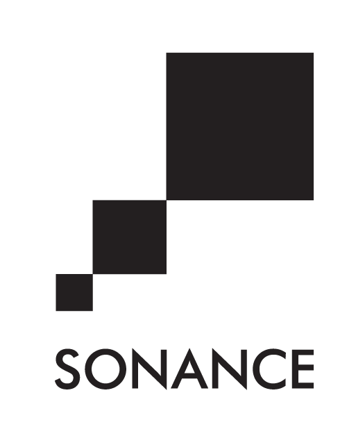
With its newly reasserted priority, it was clear that the Sonance brand needed a new logo. The Sonance logo has been through four or five design revisions over the years. The biggest change, perhaps, was a major redesign in 2006 as the company sought to move away from a design connoting a speaker – to one with more of a design or architectural connotation.
That 2006 redesign yielded the version that most in the industry today recognize as the Sonance logo. It sought to visually describe a more architectural design concept by presenting a series of three stacked boxes. This logo was definitely quite different from those that came before, but the design elements were so prominent that it was difficult to scale the logo for different usages. Not much space? Reduce the size of the overall logo to fit the “boxes” and the logotype spelling out the Sonance name is almost too small to be readable.
New Sonance Logo Revealed
Which brings us to today. What you don’t know is that you have already seen an interim version of what the new logo was to become. Last year, the company rolled out a new 35th Anniversary logo that featured a cleaner, simpler design, focused entirely on logotype. This was an interim step or the precursor to the new logo being unveiled today – shown below.

The new Sonance logo – to my eyes – seems big, bold, and has an interesting design element as part of the “A” in Sonance. This element, a separated, blue-colored, inverted V section is called the “beam,” as it hearkens to an in-ceiling speaker’s downward soundwave dispersion.

iPort Becomes iPort by Sonance

Of course, iPort will continue to hold a position of prominence as well. The magnitude of its usefulness in both the residential channel – as well as in the Enterprise channel – means its identity is also critical. However, iPort now becomes iPort by Sonance. This keeps its relationship with Sonance both readily visible and properly positioned.
You will note that this logo has changed rather dramatically as well. To my eyes (and I am NOT a graphic designer), it seems to have a readily identifiable family look with the new Sonance logo. In this case, the touch of color seems to augment the “port” or stand concept, as though it’s holding a colorful iPad.
Is This Rebranding Risky?
I asked both Ari Supran and Jason Sloan if they considered the risks of redefining their brand. Most companies going through a rebranding, do so because of problems with their business. They are looking for a fresh start, and a new logo and brand definition can sometimes help a company change its path.
But Sonance is the top architectural brand. There are many smart people who would tell you, “If it ain’t broke, don’t fix it.”

“I think there’s a greater degree of nervousness about whether we can get everything done in time and put our best foot forward. As far as how its going to be received – that we’re not going to be using Dana Innovations and we’re going to be focused on Sonance and iPort – I would say, very little-to-no nervousness about it.”
Ari Supran, CEO of Sonance
‘If It Ain’t Broke…FIX IT!’
While rebranding a company always carries an element of risk, the fact remains that given the unique circumstances of this situation – launching as Sonance, then later layering in the Dana Innovations brand on top of it – with a degree of confusion resulting…this latest strategy could play out like they are returning home to the beloved Sonance brand.
Despite the company’s great success over the last decade, smart companies learn that sometimes the better option is, “If it ain’t broke…FIX IT!”
Learn all about Sonance by visiting: www.sonance.com.
See Sonance at the CEDIA Expo in Denver, Co this month at the Colorado Convention Center, September 12-14 in Booth #2507.




I commend them for tossing in the towel. To this day our company always referred to them as Sonance, only the Rep used the Dana name.
I never understood why geography had determined the new name at the time.
Good for them
I just don’t understand why they didn’t carry over the new Sonance logo to the other new logo’s. If you want to be recognized you have to be consistent. Marketing 101. I would have put the new Sonance logo with the blue-colored inverted V under the iPort in the example of their new logo. You could still have it smaller as it’s shown, but I think that inverted V is what makes it more recognizable and identifiable. Just my humble opinion as a marketer. And yes, rebranding can be very difficult but it can be done.
Hi Deb,
I get your point. But I think the answer lies in the fact that the iPort logo ITSELF mimics the design elements of the Sonance logo and it, in fact, is its own logo – distinct from Sonance. I’m pretty sure everywhere they are promoting Sonance, they will use the new logo. But actually, the logo we are talking about is the iPort logo. The focus needs to be on iPort…Sonance is there for positioning, not design.
But I’d have to ask the designer to be sure.
Thanks for your thoughts!
Ted