Senior Director of PR & Marketing
On Monday, CEDIA launched an all-new website that represents a dramatic leap forward from their previous offering and provides a much more accessible way for members and other “customers” (more on this later) to learn, communicate, and manage their relationship with the trade group. A complete overhaul, CEDIA’s Senior Director of Public Relations & Marketing Jamie Riley told us in a phone interview that this website has been under intensive development for two years.
See CEDIA’s new website – a major overhaul for members…AND for the association…
The Custom Electronics Design & Installation Association (CEDIA) maintains two different websites on the Internet: cedia.org and cedia.net. The cedia.org website is their consumer-facing website that was launched in June 2012 and is designed to “educate, inform, and persuade, if you will, customers to utilize CEDIA members – and look for certification…and really just an unbiased information resource about home technology,” Riley told us. This website stays in place as is.
However, cedia.net is their industry-facing website…and it has been completely overhauled. And unlike other website updates where there’s a new color scheme…or some graphics have been added to make more of a splash…CEDIA has completely rebuilt the look, feel, navigation, and – most importantly – the access to training, information, and resources. It is an impressive revamp that ratchets up the usability of the website for members – or those who want to explore becoming members.
“Our main goal was to make it a great user experience and simplify the chaos, if you will, of all of the content and benefits and resources that CEDIA does provide,” Riley enthusiastically told us.
The first thing…
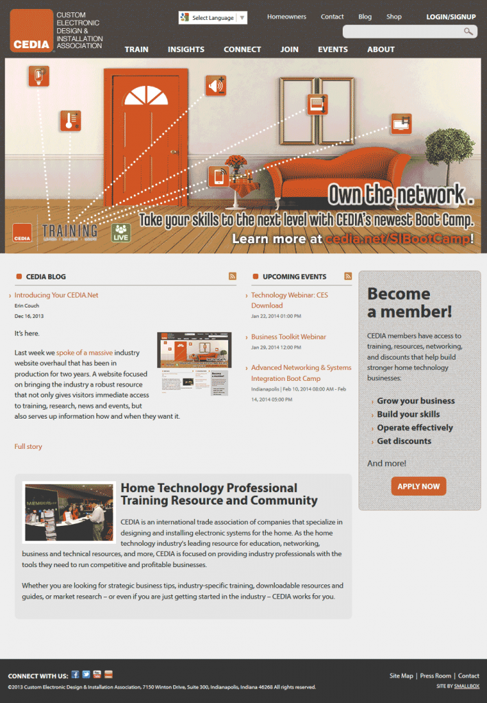
The first thing you notice when you navigate to the www.cedia.net website is a new clean look with a simplified menu structure. There is a large graphic of a living room at the top center of the site – with icons representing major home technology systems all connected by dotted lines to the word “training” shown in all capital letters. Training…is a key focus for the trade group.

Visible across the top of the graphic is a simplified menu structure listing Train, Insights, Connect, Join, Events, and About. Pretty much self-explanatory, each menu item is keyed to an area of focus for those services CEDIA provides its members. Anyone can click on them to learn more about:
- TRAIN – CEDIA defines their training efforts in three key areas: Online, In-Person, and educational resources for further study. Each of these areas has three or more sub-categories. For example, Online training contains eCourses, Lessons, and Webinars. Riley tells us that the association plans to boost its online training, based on feedback from members and its own training department.
- INSIGHTS – On this page, CEDIA offers more information about the various studies its market research department conducts on an ongoing basis.
- CONNECT – Here, members and potential members can see details on the various programs CEDIA offers. There is also information on how the association seeks to influence legislation via its government affairs staff. Finally, CEDIA also explains about how the association helps members connect with each other as well.
- JOIN – This is where you get specific information on joining (or renewing) as a member of CEDIA.
- EVENTS – Here is where you can get more information about the many live training events the organization holds throughout the year. CEDIA also holds many other member meetings throughout the year and here is where you would learn about those as well.
- ABOUT – As you might suspect, here is where you can learn more about CEDIA
The business end of the website…
In the very upper right-hand corner of the website, you see a button marked LOGIN/SIGNUP. Here is where you go from the pretty face of the web-facing website, to an internal, password protected “get down to business” section of their website that CEDIA calls their Ebiz site. Don’t have a password? No problem! Anyone can sign up for an account!
That’s right, members and non-members both can enter the password-protected section of CEDIA’s website. But what each of them can see – or access – is totally dictated by their membership status.
The theory, Riley told us, is that those residential technology companies that are seriously interested in joining the organization can do a deeper dive to learn more…much more…about what membership will bring them. So these onlookers, customers, Riley called them, can for example, see what Resources are available to members…they just can’t download them.
‘Customers’ won’t see what members see and won’t pay what member’s pay…
And for those things that the organization does make available to non-members for a charge, these customers will be able to purchase those items. Of course, members get many of these items for free…or for drastically reduced prices, but customers won’t see that information.

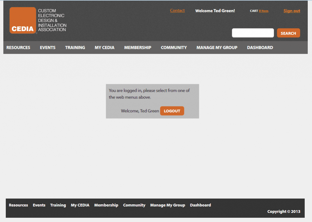
This section of the website has a no-nonsense look. There are no fancy graphics here – just a carefully designed menu structure for easy navigation. Once logged in, you are presented with a top level menu: Resources, Events, Training, My CEDIA, Membership, Community, Manage My Group, and Dashboard.
Hover your mouse over any of these menu items and a sub-menu drops down. It quickly becomes apparent that these menus aren’t taking you to pages that are marketing these items – it’s taking you to the items themselves. The organization has a tremendous amount of data and resources it makes available to members and it is clear that a lot of thought went into the menu labeling to help you find what you are looking for. When a page is selected, further sub-menus slide out to the side…and the pages themselves may have hyper-links to further items to choose between.
Two extra special sections…
 Two areas of this section of the website deserve special mention: My CEDIA and Manage My Group. The My CEDIA section is where you manage your direct relation with the organization. You can set your profile, update your areas of interest, subscribe to various mailings from the group, see your shopping cart for anything you may have ordered, as well as your order history. All organized in one easy-to-find spot.
The Manage My Group menu item only shows if you set up your account as the “administrator” for you company. In that case, CEDIA has made it easy to manage the interaction between the association and your entire company. Here you can see which employees are registered for what training, a calendar of upcoming events where one or more of your employees are scheduled to attend, and in general, all important employee records and transcripts.
Make more sense…
The logic of the layout is quite intuitive and will make more sense as you use the website – as opposed to reading a description of it. We were struck by the sheer amount of information present at launch, some previously available…but much of it all new.
“You know we didn’t just copy and paste our content…we rewrote every single item on the website,” Riley emphasized. “And we built new content on the learning site. Everything that you’re seeing is about 90% new.”
What’s that behind the curtain?…
But as significant as this redesign was, we discovered during our interview that there’s more than meets the eye. The association has done more than make their resources easier to find and access for members – they have also taken a major step in a systemic upgrade that will enhance the speed and efficiency with which CEDIA itself can serve their membership – a point we uncovered during our interview but not mentioned in the official press announcement.
“It took us two years because it’s not only just a website redesign/reorganization, if you will – the back-end is powered by a brand new association management system software that the board of directors decided to invest in,” Riley emphasized. “And what that has done is allowed CEDIA as an organization to eliminate multiple systems that are housing multiple layers of data and not talking to one another. So it allows us to better serve customers…and our membership even more so.”
In our initial test drive, we found the menu structure easy to navigate. It is still possible to get lost, but those instances are very rare – you almost have to work at it to lose yourself. Generally, it was easy to move back to the top menu and redirect yourself. Thinking like the typical CEDIA member, we believe that the My CEDIA and the Manage My Group sections will be very appreciated as they appear to dramatically simplify these important interactions.
Check out CEDIA’s new website for yourself, see: www.cedia.net.
Tell us what you think in a reply to this story below…


Leave a Reply